Tuesday, January 10, 2017

Greenbelt Rampager - Magic the Gathering

If it doesn't have enough energy, it'll go home.
While I wasn't impressed with Lifecrafter Bestiary's name, I'm less impressed with Greenbelt Rampager. With the former, the words were at least a little more unusual. With the latter, the words sound way too normal.

The main thing I do like about this card is the effect. While it makes less sense from a flavor perspective, the effect is extremely innovative, and it is doing something I haven't seen normally. This card is a big creature for a little mana, meaning it has some sort of drawback. Here when you play it, you have to pay two energy or it fizzles out. What's new though is instead of going to your graveyard, the card goes back to your hand and you gain an energy. Meaning you can technically play this card in a turn for three green mana, which fits with the stats given. I also like how they carefully worded it so that paying the energy isn't optional, meaning you can't repeatedly bounce it back to your hand just to fill up on energy.

The art composition is pretty straightforward, with a big gray elephant tearing apart a pillar in the foreground, but it still does a few neat things. I like how if you look closely at the elephant you can see swirls and markings. This also fits with the design of most of the aether creatures. We also have some contrasting blue on the pillar, though the red on the building behind it feels a bit loud.

VS Lifecrafter's Bestiary: Name -, Text +, Art -

Monday, January 9, 2017

Lifecrafter's Bestiary - Magic the Gathering

"Aethorn, the Aether Horn Pokemon."
All has been revealed. With the spoiler for Aether Revolt complete, I thought I would handpick my first set of reviews from the set (excluding those planeswalkers from early December).

The name Lifecrafter's Bestiary feels a bit ornate, which on one hand fits the flavor of the card but on the other makes it a mouthful of syllables to say. It's the concept of this card though that strikes me as familiar. It's a small pocket device that seems to scan the data of different creatures you encounter. Sorry, but this thing is a Pokedex. Even the way the thing flips open reminds me of a Pokedex. Now don't get me wrong; there's is nothing morally or legally wrong with this, I just find it hilarious.

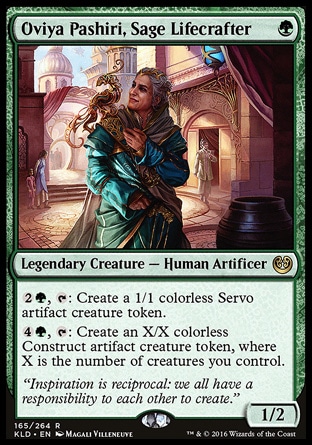
In order to make this card feel more like a monster index, there are some library manipulation mechanics. So the first effect scrys, like your casually browsing your database, while the second effect adds or calls an entry once you cast a creature. Another thing of note is this card is part of a cycle, similar to Bastion Mastodon's cycle. Each card can go into any deck but has a bonus effect if you have the right color mana. To round this all off, we get a simple, inspirational quote from local legend Oviya Pashiri.

I would say the art is not as good as Bastion Mastodon, but that doesn't stop it from being gorgeous. We have multiple planes at play, with the foreground showing us the device and the subject's hand using it, while the background shows a greenscape and a family of beasts, all slightly blurred to convey distance. We also have different color schemes for both planes, with darker browns, greens, and golds in the foreground compared to the lighter greens, whites and greys in the background. The art is once again extremely intricate. The bestiary resembling a pocket watch that can fold itself out, and I love the detail of the baby beast. Mastodon only wins out in the end because it has a much more detailed background, and the subject feels a lot more impressive than the little device shown here. Still, this art is pretty good.

VS Bastion Mastodon: Name -, Text +, Art -

Saturday, January 7, 2017

Bastion Mastodon - Magic the Gathering

Robo-elephants on parade!
I love the concept of this card: a robotic elephant. There are very few creatures that I don't find cool when turned into a robot, so I do enjoy how there's a ton of different species on Kaladesh. The name isn't that interesting, but the repetition of the "ast" in the first and second word strikes my lyrical cord.

The ability is part of another cycle of cards, each one an artifact creature with a colored activated ability that gives it a keyword until end of turn. The idea is you can play them as vanilla creatures (creatures without effects) in any deck, but if you have the right mana you can activate a little bonus. It's much more interesting from a mechanical standpoint than a flavorful one.

I definitely love the art for this card, and how the piece is structured. You first have the contrast between the subject and the background, with the background being whites and lighter colors, while the elephant itself is darker colors. There's also just the contrast of this tranquil palace setting with the mechanical behemoth standing in the middle of it. We also have scaling people to give us a sense of size, and a richly detailed background. While most of the elephant seems to be standing still, the head takes on a bit more of a dramatic pose, with the mouth open and the trunk whipping around.

VS Aether Tradewinds: Name +, Text -, Art +

Thursday, January 5, 2017

Aether Tradewinds - Magic the Gathering

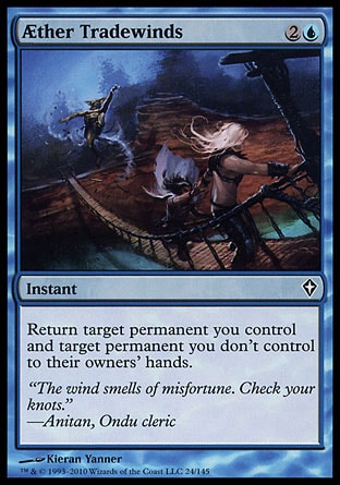
There's a man on the wing of the plane!
There is a little story behind this card's name. This card is actually a reprint of a card from Worldwake, but the name was spelled slightly differently. For awhile, Magic the Gathering would spell the word "aether" using that weird symbol that looks like an A and an E smashed together. Once Kaladesh hit the shelves though, they changed the spelling to use standard letters, probably to make things feel a little less awkward. While new cards were printed using this new spelling, this was the first card to be reprinted using the new spelling, helping confirm this was an official change. Other than that, nothing is too interesting about the name, though tradewind is derived from a real world sailing and nautical term.

The effect is simple and symmetrical, which I like. The flavor is easier to grasp too, with both permanents going for a ride together on the wind. The flavor text helps to reinforce the conflict between the consulate and the renegades, showcasing both ideologies. The consulate is careful and rules oriented, while the renegades are reckless and rule-breakers.

I like the intricate design of the airship in the art, the downside of which is I have a hard time telling that is an airship. The background is mostly sky with a hint of city in the left corner. There are also some blue atmospheric effects, showing the ship gathering aether. What amuses me the most though is the small man in the upper right corner, hanging on for dear life.

VS Fumigate: Name -, Text +, Art -

Wednesday, January 4, 2017

Fumigate - Magic the Gathering

Death from above.
The first thing about Fumigate that impresses me is just the simplicity of it. It's a very simple name, paired with an almost as simple effect. Cards like this are designed to be reprinted. They have a generic enough name that they can be used in any setting, but also a simple yet useful effect that they may want to use again.

One tripping point is the second clause of the effect. I understand how fumigating a general populace would destroy them, but why am I gaining life afterwards? Are we doing something with the corpses? Does the mass killing clear the way for some public works project to repair damages? From a mechanical standpoint, the clause makes more sense, but from a flavor one, I don't quite get it.

I like how the art is split into two, contrasting planes. You have the reds and browns of the gremlins scurrying on the ground at the bottom, then at top you have the blue and white sky, with the distinct multicolored thopter to draw in the eye. I also like how it's staged as a point of view shot from the ground up, and the multiple scaled gremlin figures receding from left to right to create a sense of distance. The art also depicts the moment before the destruction.

Tuesday, January 3, 2017

Madcap Experiment - Magic the Gathering

"Hope it's not a fox again..."
Compared to Woodweaver's Puzzleknot, Madcap Experiment is a much more normal sounding name. The word that stands out is "madcap", a less used English word meaning rash or reckless. The one benefit of the name is that it perfectly describes the card and its effect. The card is madcap and it is an experiment.

Also unlike Woodweaver's Puzzleknot, the art is much more dynamic. It is trying to capture the explosive aftermath of the experiment, with dirt and debris flying. But instead of showing us the results, it's showing the reaction of the subject. I love this view point, since it keeps with the perspective of the player. The player doesn't know what they are going to get, just like how we can't tell what the experimenter got in the art. I also enjoy how patchwork the experimenter's clothing look. It's another way of capturing that madcap feel. It also gives us some contrasting blues to focus on in the mostly red and gold palette.

Finally we have the text. I love weird effects like this, since they are things card games don't do too often, making this feel special. The extra text space also allows them to get a bit more creative with the effect. The flavor of this card is also a lot stronger than Woodweaver's Puzzleknot. You are performing a reckless experiment, unsure of what will happen. In the end you will get an artifact, but there will also be some negative reactions, and the results may not be what you were hoping for.

Monday, January 2, 2017

Woodweaver's Puzzleknot - Magic the Gathering

How much wood could a woodweaver weave...
So Aether Revolt is on the horizon, and while I could rush out reviews of the preview cards, I prefer waiting a week for the entire set to be revealed instead of me mass speculating. Until then, I am going to turn back and look at the set's big brother, Kaladesh.

First, the name. Woodweaver's Puzzleknot is a better name than, say, Tresspassin'. For one thing their are no weird spelling issues, but also the former uses much more intriguing, yet familiar words. One trick Magic has learned to do is make up its own compound words. In this case we have two: woodweaver and puzzleknot. Our brain recognizes the individual words, but when it sees the two together it raises our curiosity. It makes us stop and think, which also makes us pay attention to the card. There is also a little alliterative appeal with the first word, "woodweaver". As for the second word, this card is part of cycle (a group of cards that share a similar design). There are five Puzzleknots in the set, so the second word identifies it as part of the cycle.

The art is also much better. The colors are bright, contrasting golds and greens. No ugly brown filter here. Then we have the object itself. The entire thing reminds me of one of those wire games where you have to move a rod through the entire track without touching the sides. Can't tell if that's the case with this, but it does include some kind of stylus. I love how intricate the whole thing is, and how the shapes manage to look both artificial and organic. I also love the background, which mimics the pattern, and the clear space that forms a sort of halo around the puzzle, making it stand out. And of course there are the hands. There are two reasons for including hands in the art. One is it works like the scaling birds, that is they give you a sense of the size of the object. Two is they just make the piece more interesting and less like a still life.

But now we get to the mechanics. As I mentioned, this card is part of a cycle. The way the cards worked were you got an enters the battlefield ability, and then you could pay a colored cost and sacrifice the card to repeat that ability. I'm guessing the second ability is meant to be you solving the puzzle, but I'm less certain how the first ability works. I have no idea how this card gives me three energy and three life, though I appreciate the little symmetry within the effect.

Saturday, December 31, 2016

Tresspassin' - Doomtown: Reloaded

You short folk ain't welcome here!
So, one thing you learn about this card when trying to do a Google search is the first part of the word is supposed to be spelled "tres" and not "tress". I'm guessing this is an intentional misspelling in order to convey an accent or a drawl. This is supported by them dropping the "g" at the end.

Flavor wise, this is a perfectly okay card. There are people on your private property you want off, so you confront them and tell them to leave or you'll call the cops. They either go home or become wanted by the law. The flavor text seems to be commenting on the scene, and becomes funnier when you juxtapose it with the image. Apparently two old people with rifles are worse than the sheriff's police.

But now we get to the art. First off, why are the criminals so short? I would say the old couple are just standing on top of something, but the proportions of the criminals seems far too off for that to be the case. Did the art description ask to depict dwarves? Then there's the colors. Absolutely none of the colors are bright, and everything just looks brown and muddy. Even the greens and blues look closer to a gray. Again, the only positive point is the humor, since you don't associate two elderly residents with pointing guns at outlaws in the old west.

Thursday, December 29, 2016

Stagecoach Office - Doomtown: Reloaded

Your coach will arrive in a moment.
Stagecoach Office actually shares a name with a card from the original Doomtown, but the similarities end there. The original was an extremely powerful ghost rock engine, while this version is much more scaled back. The effect is simple but flavorful. In essence, you're calling in a stagecoach to take your dude into town, dropping them off wherever you have a stop.

The art on the other hand is not my favorite. Part of my problem is just how nondescript it is. This feels like it could be any building in town, and not the one named. You can barely even see a stagecoach in the art! It's off to left side, mostly out of frame, and the only detail calling attention to it is the wheel. I do however like the arrows sticking in the side, since that tells a little story that happened off canvas. The color scheme is also mostly brown. I understand the purpose of this palette, since we are dealing with an old west setting, but it makes everything so uninteresting and unappealing to look at.

Wednesday, December 28, 2016

Marion Seville - Doomtown: Reloaded

You don't want to know what happened to the guy who called him "Marian".
Marion's has a pretty simple effect, which names one of the mechanics of the game: becoming wanted. In the game, there are locations called deeds, which are marked as either public or private. When a dude has a shootout at a private deed, and that dude's player doesn't control the deed, the dude becomes wanted. Some outfits, like the Law Dogs, punish wanted dudes, while Marion's outfit, the Sloane Gang, gives benefits for being wanted. So while Marion doesn't have a standout effect, he does highlight something his group cares about. Flavor wise, I don't quite grasp how the effect works. Maybe he draws both his knife and gun when he becomes wanted.

The flavor text doesn't try any grand world building, but it does at least develop the character, signaling a pet peeve while setting up a previous incident in his life. Plus Pancho mentions that this was the "last" man, meaning there has probably been more than one previous incident. Overall though, I think the text is trying too hard to be humorous. Too be fair though, I have been guilty of the same thing with my captions.

The art has sharp linework, so everything is at least detailed clearly. The framing is nice, with the figure in the center, and the doorway centered behind him. There is also the splash of red on the bandanna, which draws the eye's attention. The one grievance I have is that behind the doorway is nothing but black. I don't want anything too over-detailed, since that would distract from the subject, but we could have had something, maybe just a few silhouettes.

Tuesday, December 27, 2016

A Coach Comes to Town - Doomtown: Reloaded

Santa's coach is coming to town.
So this Christmas, I got a box of Doomtown Reloaded. Awhile ago in the 90s, there used to be a TCG called Doomtown, set in the Deadlands Weird West RPG setting. It was mildly popular, but then the game folded. Several years ago, with the rise of fixed expansion games, an attempt was made to bring Doomtown back from the dead. Rules were simplified for easier, more intuitive play, and a new game called Doomtown Reloaded was released. This year, that game also seems to have folded after the game rights were returned to the owner of the RPG. So some of the cards I am looking at had counterparts in the original card game, and this is one of them.

The main difference between the original and the new one is A Coach Comes to Town used to be an event. Event cards were a hold-over from the Legend of the Five Rings, which Doomtown has many similarities to, and they took effect immediately. Doomtown Reloaded ditched this card type, and any cards they used which were originally events were modified into action cards, giving players greater control over when they activated.

The effect has remained fairly similar and flavorful. A coach comes to town with a shipment of ghost rock. If the coach arrives safely, you get 4 ghost rock. If the coach is robbed, the opponent who robbed it gets the ghost rock instead. Slight tweaks include you are now the one pulling the job, while before it was any opponent who wanted to try to rob the coach was the one starting the job. Also, when the coach was robbed, you had to pay the opponent the ghost rock, which didn't make sense since the flavor of the card was you hadn't gotten the shipment yet.

The art is hit and miss for me. I like the angle of the shot, showing the entire stage coach with your posse surrounding it. I also like how the figure leading the job stands out, with sharp, contrasting blacks. While I do appreciate the more realistic art style, I don't like the gradient filter. It makes the scene look far too red and washed out.

Because of the rules overhaul, the new version has a little more text space, meaning we get an additional line of flavor text, as one of the characters compliments and complains about Lane Healey, the scoundrel and go-to guy of Morgan Cattle security.

Friday, December 23, 2016

Johannes Broheim - Warhammer: Invasion

"I'm on a griffin! I'm on a griffin!"
I've covered several other cards with impressive mounts, so it only feels fair that I cover the guy riding the griffin. I love the art, though the background does suffer from being barely comprehensible, but it does have a neat lighting effect. Johannes's beard helps give him a veteran status, which helps with the problem Urguck had of not feeling that much higher in rank. I also love the war banner and the tassels pinned to griffin's lapel.

The one point of confusion I have is the long, stick-like object shown to the right of the griffin. To me it looks like a massive longbow, but it doesn't look attached to the griffin or to the ground. It just seems to be hovering in place. I like the effect it creates. The bow adds a greater sense of aimed direction, plus it makes the whole unit feel like the quiver of some massive weapon. I'm just still not sure what it actually is or where it exists in terms of this scene.

For rules text, you have the Hero clause again, followed by counterstrike, sans reminder text. Since this was a core set, they made sure to put reminder text on most of the cards, but there were a few exceptions, seemingly due to spacing. What counterstrike amounts to is when the unit defends an attack, it immediately deals counterstrike damage to the attacking parties. What I like most though is the final ability. In the Core Set, Warhammer didn't have a keyworded flying mechanic. Still, there are some units like Johannes who can obviously fly. I feel the final ability helps capture the feeling of flight, as it lets your unit move around very easily. And since this guy is a Hero, meaning he has the Hero limit, this makes the ability even more useful.

Thursday, December 22, 2016

A Glorious Death - Warhammer: Invasion

Tis not so hard to die. Tis hard to give death meaning.
Quest cards are an odd, slow mechanic. What happens is you play a quest in your quest zone, then you send a unit on that quest. Each turn, the quest gains a resource token. This token is treated like a generic token and not a resource, so I guess they just wanted to use what tokens were at hand rather than create a whole new type of token for a small subset of cards. You can then activate abilities based on the number of tokens on the quest. If the questing unit leaves the quest, all tokens are removed and you must start anew.

The art is also odd, as instead of full color art like on regular cards, they instead use line art. The card background is a faded manuscript, so the idea is to make it look like the art was drawn on the ancient paper. There is nothing wrong with this, it's just another odd choice. As for the art on this card, I do like the belt of of faces.

I honestly like the flavor of this card. The dwarves in this set show a tendency toward self-destruction, seeking to destroy the enemy even if it costs their own lives. This card represents that mentality perfectly. The fact that it targets two units also gives it enough card advantage to justify the time spent completing the quest.

Wednesday, December 21, 2016

Urguck - Warhammer: Invasion

He can peel off his scars and use them to raise an army!
While he doesn't get to ride a dinosaur, Urguck still has a pretty ferocious riding beast, with horns and crooked, jagged teeth. His axe looks giant to the point of ridiculousness, but Orcs were never known for their practicality. I like how the artist decided to shake things up with the weather effects, including a dramatic bolt of lightning in the background. It makes the whole thing feel less like a typical fantasy portrait. I do wish we had a bit more cues to distinguish Urguck as an Orc leader, like maybe some underlings in the background. Other than the riding beast, he still looks like your typical over-muscled orc.

The card however does make sure to let you know he's special. First you have the little symbol next to his name. This marks the card as unique, which usually means you can only control one copy of it at a time. Second is the Hero trait. Only a few cards in this set get the hero trait, and they all come with the same rules. You have three zones in the game you can normally play units in, but you can only have one Hero in each of your zones. This again makes the card feel different from your typical mindless soldier.

The main thing I love about this card however is the game mechanic. In the game, you have a pool of resource tokens and damage tokens. From the names, you can probably tell what each token does and represents. This card allows you to use one type of token as if they were another type of token. That is actually pretty innovative and clever. It's also a healing mechanic that doesn't feel like you're healing a unit, since that goes a bit against the Orcs' flavor.

Tuesday, December 20, 2016

Nurgle Sorcerer - Warhammer: Invasion

The forces of Chaos extend to spelling.
There is one main reason I chose to do this card, but let's look at a few other things first. The art is a decaying humanoid with horns, a skull stuff, and sorcerer robes. With how dull the rest of the colors are, it makes the green shooting from its hand and glowing from the skull on its side really pop out. While I understand this is meant to be a battle scene, I really don't like that the background is just a dusty mess. I do however like the few discernible figures you can see among the dirt.

The ability is okay, the main thing I like is the the corrupted clause. It lets new players know that corruption is something this card and faction cares about, while also piquing their interest to look up what the corruption mechanic actually is and how it works in the game.

Now, to the main course. Look at the name of the card. Now look at the card's traits. Notice a discrepancy. In the name, the spelling is "sorcerer" with an "e". But in the trait line, it's spelled "sorceror" with an "o". I have no idea how this got past the editors, but it looks really awkward having it spelled two different ways on the same card.

Monday, December 19, 2016

Cold One Riders - Warhammer: Invasion

Welcome to Jurassic Empire!
This time I'm going to take a lot at an older card game, but not too old. It's called Warhammer: Invasion, which is like W40k except with the sci-fi trappings replaced with fantasy ones. It's one of the LCGs the Fantasy Flight Games has stopped printing new expansions for, but the game lasted for quite a while, having even more expansions than its space-based counterpart that was released after its retirement.

So I'm starting off with a card that is aesthetically awesome. What's so awesome about it? It is an elf riding a dinosaur! It gets even better. When you look at the name "Cold One", along with the icy backdrop in the art, the implication is this is also an arctic dinosaur! It is really difficult to cram this much awesome into one card.

Another thing I really like about this card is a little harder to explain, but it comes down to statistics. Say you have a two mostly blank cards, one with a bunch of 1s printed on it and another with 4s and 5s. Now say you have two pieces of art, one depicting a turtle and another depicting a dragon. On which card would you put the turtle art, and on which would you put the dragon? Naturally, the dragon would go on the card with the higher stats, because dragons are bigger, better, and more special than turtles are. When you make a game card with high stats, you have to make sure what you put on it feels worthy of those stats, and this card succeeds with that.

One final thing to mention is a strange quirk with the Core Set. While the game acknowledges that it has six main races, there are only decks printed for four of them: Dwarf, Empire, Orc, and Chaos. The other two, High Elf and Dark Elf, and left to stew until they get their own full decks in the next deluxe expansion. To tide players over though, there were a handful of cards belonging to these races printed in the set. I only mention this because that means, in the box, this card would have felt even more special, since it's a member of a rarer race.

Friday, December 16, 2016

Fairchild - Android: Netrunner LCG

Now, they have all come together.
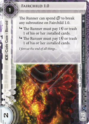
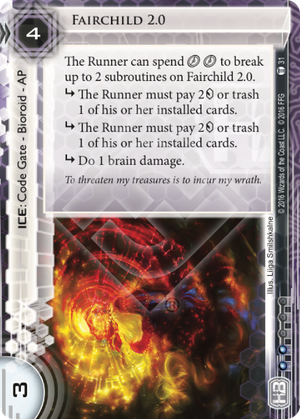
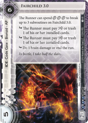
There is actually quite a history behind Fairchild, this being the fourth card in a line that has spanned multiple sets. Before Fairchild, there was Fairchild 1.0, Fairchild 2.0, and Fairchild 3.0. How are they all connected? Let's start with something easy first: the art. Each card has art done by Liiga Smilshkalne, so all feature a similar palette and style. Now for the first three cards, each card depicts a separate figure, but here the heads of all the figures have joined together into one entity. Another quick note is that all the cards until now have be non-unique, but this version of Fairchild gets unique status, again showing the growth of the card.

Another thing is that each card serves as an upgrade of the other. The most obvious is the increasing cost and strength of each card. Even the influence cost goes up as the card gets more powerful. Next you have the first ability. With bioroid cards, most of the cards have text that allows the runner to bypass so many subroutines is they spend so many clicks, with 1.0 being one, 2.0 being two, etc. With Fairchild though, things have evolved to the point where that piece of text has dropped off completely, which really strengthens the card.

The subroutines have also evolved over time, though the last one makes some more drastic changes. Fairchild 1.0 had two subroutines that were pay 1 credit or trash a card. Fairchild 2.0 upgraded this to pay 2 credit or trash a card, plus it added another subroutine that did 1 brain damage. Fairchild 3.0 upgraded this again to 3 credit or trash a card, and added the option of ending the run to the last subroutine. But now we get to Fairchild. Now all the subroutines are about ending the run, with each one offering an alternative cost for the runner. So the first two subroutines lets you pay 4 credits, the third one lets you trash a card, and the fourth one lets you suffer brain damage. All these subroutines still call back to what came before, but they have still been completely modified.

Overall, what interests me about this card is less the card itself and more the journey it has been on.

Wednesday, December 14, 2016

Baba Yaga - Android: Netrunner LCG

Ba ba ya ga ga....
Baba Yaga is a witch of traditional eastern folklore. She's probably most famous for her walking chicken house, so I'm surprised the card went with something else. In folklore, witches seemed to use household objects as magic vehicles. In the Americas it became mostly the broom, but Baba Yaga did in fact use a mortar and pestle, though she still has a broom with her in the quote. As for that quote, yes, it is from a real Russian fairy tale collected by Alexander Afanasyev.

Now as for the card itself, I find it odd the art went with depicting the mortar and pestle as opposed to the witch herself, though we at least get some menacing figures standing around it. I like to interpret this card's ability as the AI can learn and use programs, similar to how a witch uses spells. Making the program a cyberwitch, which I find very cool.

Tuesday, December 13, 2016

Sapper - Android: Netrunner LCG

noun: a soldier employed in the construction of fortifications, trenches, or tunnels
I've heard the term "sapper" used before, but I couldn't exactly define what it was. I looked it up on Dictionary.com, and came up with a few results. A sapper is someone who digs trenches or other fortifications. Further digging (sorry) turned up that the word "sap" can also mean a deep, narrow trench. The term is mostly used in the military, but I have heard it connected to mining as well.

Well, vocabulary lesson over, on to why I picked this card. I'm not intimately familiar enough with the game to say these things have never been done before, but they are rarer abilities. First you have the ability where if the runner accesses the ICE, they are forced to encounter it. Equally rare is the ICE has a trash cost.

The art is fine, with smooth slabs sinking into a pit in the ground, which alongside the flavor text of the card, makes me think of Dante's structure for hell. Speaking of which, how many different things are there colloquially said to be a special place in hell for?

Monday, December 12, 2016

MKUltra - Android: Netrunner LCG

I can neither confirm nor deny the existence of this card.

Recently, Netrunner's Martial Law expansion came out, so this week I'm going to look at a few cards from it.

First, the name. MKUltra was a real project run by the CIA to discover the secrets of the human mind and how it behaved under adverse conditions. In short, they wanted the secret to mind control. What's really controversial about MKUltra was less the subject matter and more the methodology. Most of the organizations and institutes involved in MKUltra had no idea what they were really a part of, and a fair number of subjects had no idea they were being experimented on. The entire thing was kept securely in the dark, and the whole incident would become the poster child of government organizations performing sinister things behind the public's back.

All that history seems to play very little in the card mechanics, but it does set the flavor of the card and conjures feelings of civil unrest against the government. Mechanics wise, this card does a few new things. You have the recursion ability, which lets you play the program back from the heap when you encounter an ICE weak against it. And the second ability starts as a standard strength boosting ability, but with the additional effect of letting you immediately break subroutines. This entire thing is also carefully worded so that it still works if you can't break a subroutine, or can't break the maximum two.

The art is nice and psychedelic, which is standard for cards depicting the virtual world. I especially think the two different eyes fit the flavor. It calls to mind the idea of government monitoring, but also the idea that the public is looking back, trying to gaze under the surface and see what is really going on. I also like how you have one eye gazing away from the player, while the other is looking straight at them. Also, we have another quote from the Flashpoint.